
Dear J.D Salinger, it wasn’t personal.
book cover redesign
Role: Everything
Description: Re-design
Time: 2024 - 4 weeks
The Mismatched Shelf Moment
A fan of J.D. Salinger wouldn’t know these books were written by the same author if they skimmed them on a library shelf. That disconnect bugged me. The covers didn’t match the voice, the sharpness, or even each other. This project started with a simple question: What if Salinger’s books looked like they belonged to the same world, and still caught your eye today?
BEFORE


AFTER


Creative direction, illustration, typography. This was my first real design project, a trust fall into Adobe Illustrator and Photoshop. The goal? Figure it out as I went, and make something that felt thoughtful, not timid.
Tools, Trials, and Typing Through It


Unifying the Unsaid
The challenge was finding a motif for each book that felt relevant enough to honor the work, but still strange or curious enough to draw someone in. Not to mention, they also had to go with each other to stand as a collection. I leaned into type and bold visuals that hinted at the odd, slightly offbeat tone of Salinger’s writing.
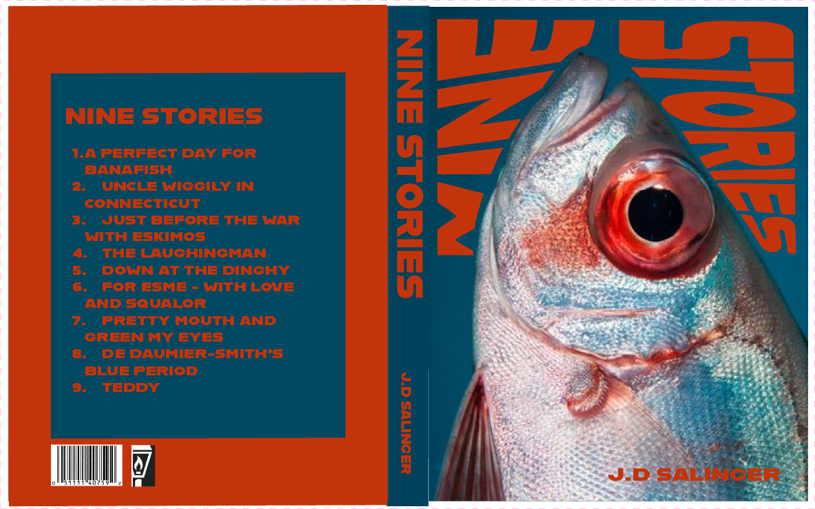
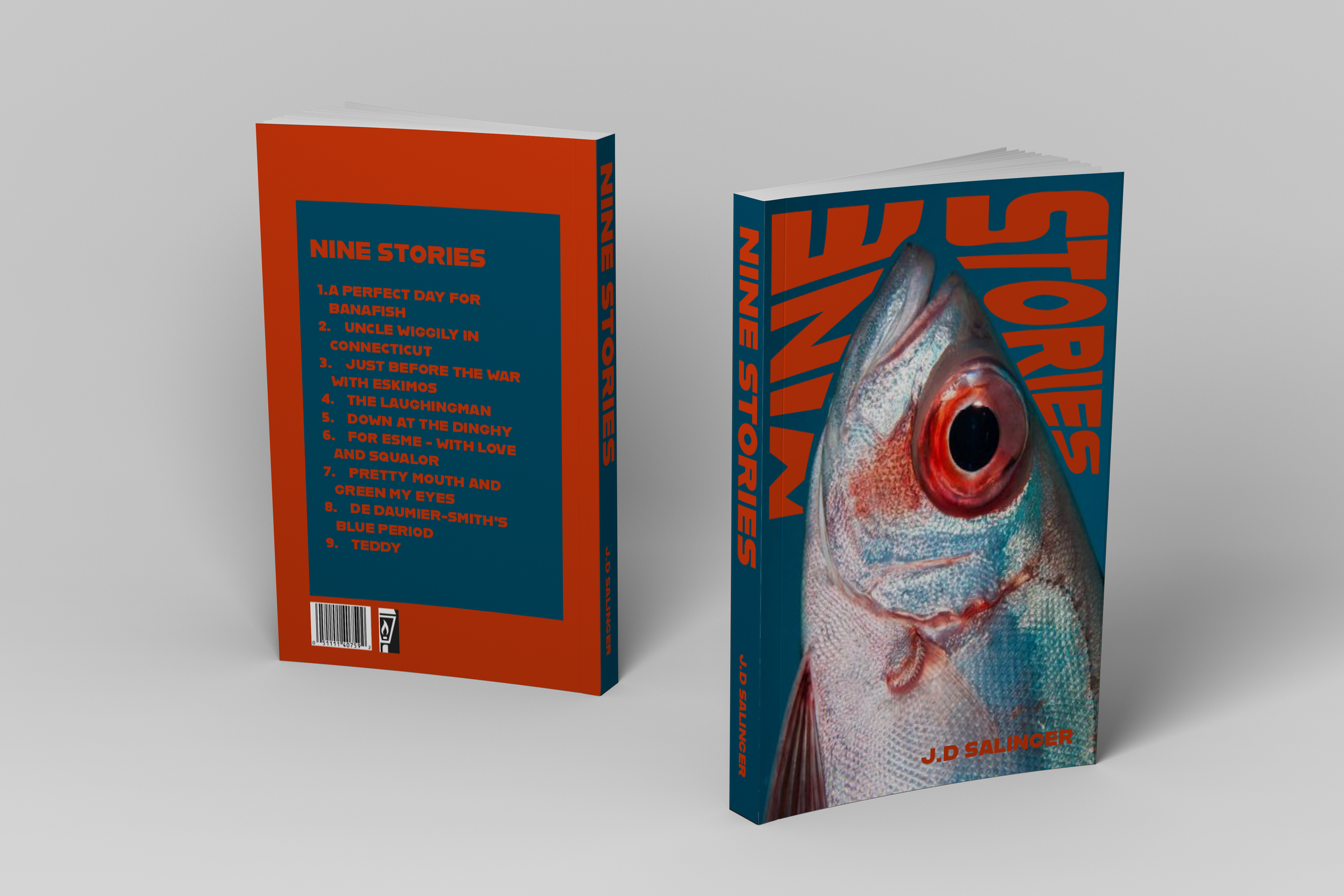
The Banana/fish
The bananafish is a fictional character described by Seymour Glass in "A Perfect Day for Bananafish". The bananafish gorge themselves until they die, a haunting metaphor for postwar trauma, emotional excess, and isolation.
The Cigarette
The cigarette is more than a habit in Franny and Zooey, but instead also acts as a nervous tether. The cigarette speaks to spiritual longing dressed in mid-century disaffection; smoke as both smokescreen and sacrament.
The Hotel key
Much of Raise High takes place in a confined, borrowed room, and Seymour remains a locked door the narrator can never fully open. The key then transcends the meaning of a door.
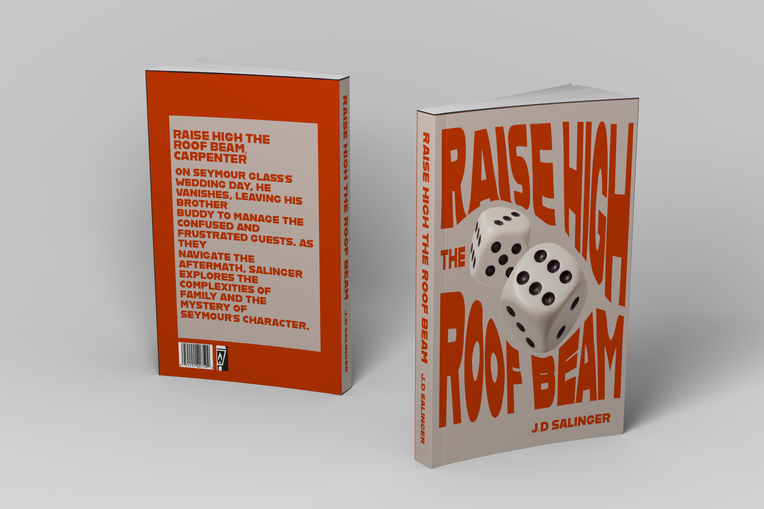
The Dice
The dice are a metaphor for Seymour Glass himself: unpredictable, unreadable, and always showing more than one face. In Raise High the Roof Beam, we never fully grasp him; we only see the angles others interpret.


As a Collection
Each motif is deceptively ordinary: a fish, a hotel key, a cigarette, but in Salinger’s world, the mundane becomes mythic. These objects are access points into the private, psychological landscapes of the Glass family.
Design, Subtextually
This one's a specialist piece: highly typographic, visually driven, and deliberately restrained. I was aiming for clarity with character. Each cover needed to hold its own, but also live comfortably within a system. The challenge was to balance distinctiveness with cohesion, using as little as possible to say as much as possible. The result is a set that's sharp, pared back, and unafraid of quiet confidence. It still stands out as one of my most striking systems. I think it always will.


The Sparknotes (Besides Photoshop for Dummies)
This was the project that taught me how to think in type, and how to bend the “rules” of design without breaking the whole thing. I learned that cohesion doesn’t have to be boring, and a strong concept can carry you even when your tools are brand new.